How do you make a dark theme in react JS?
I know if you visit any website. You saw Dark mode and Light mode functionality for those who might be interested in knowing how to implement the functionality of dark mode using React js. In this blog, we will cover all the steps to create Dark mode in React: An Easy step-guide Tutorial that will clear your all concepts.
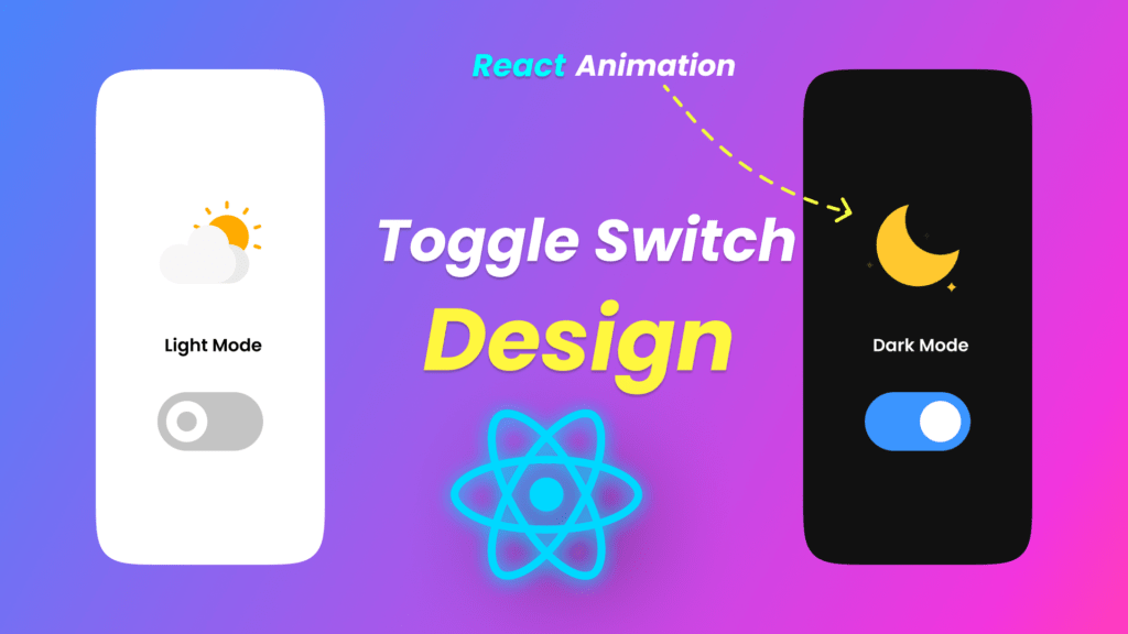
Here is what we are going to build

Here are the steps we are going through in this article:
- Create Your app with react script using cmd ( npx create-react-app my-app (your app name ) ) .
- Create our CSS for smooth dark mode in React and for styling.
- Create logic for dark and light themes in the DarkMode component
- Create a simple toggle button to test the functionality in app.js
- Switching from dark to light mode as the final Demo.
Video Tutorial
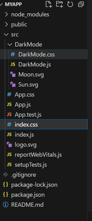
Before start building the functionality let’s understand the folder structure.

Step 1: Create Your app with react script using cmd
It’s very easy to create react app. We will be using react-script
npx create-react-app my-app
cd my-app
npm start
Now if you have completed step 1 for creating dark mode in react js. Let’s move to the next step. This is step 2 where we will be working on CSS parts for styling purposes.
Step 2: Create our CSS for smooth dark mode in React and for styling also.
Let’s start the css from index.css because we have defined the dark mode and light color variables in it so that we can use them in other css files as a variable.
Index.css
:root{
  --body_background:white;
  --body_color:black;
  --link_color:navy;
}

[data-theme="dark"] {
  --body_background:#282c34;
  --body_color:white;
  --link_color:cyan
}

*
{
  transition: all 0.3s ease-in-out;
}

body {
  margin: 0;
  font-family: -apple-system, BlinkMacSystemFont, 'Segoe UI', 'Roboto', 'Oxygen',
    'Ubuntu', 'Cantarell', 'Fira Sans', 'Droid Sans', 'Helvetica Neue',
    sans-serif;
  -webkit-font-smoothing: antialiased;
  -moz-osx-font-smoothing: grayscale;
}

code {
  font-family: source-code-pro, Menlo, Monaco, Consolas, 'Courier New',
    monospace;
}
Here we have defined color variables and for the smooth working of the toggle button also defined the transition property for it. lets jump into another css file which is app.css .
App.css
it is already defined by the default app so you don’t have to write much for it because during the react script it has already been created.
.App {
  text-align: center;
}

.App-logo {
  height: 40vmin;
  pointer-events: none;
}

@media (prefers-reduced-motion: no-preference) {
  .App-logo {
    animation: App-logo-spin infinite 20s linear;
  }
}

.App-header {
  background-color: var(--body_background);
  min-height: 100vh;
  display: flex;
  flex-direction: column;
  align-items: center;
  justify-content: center;
  font-size: calc(10px + 2vmin);
  color: var(--body_color);
}

.App-link {
  color: var(--link_color);
}

@keyframes App-logo-spin {
  from {
    transform: rotate(0deg);
  }
  to {
    transform: rotate(360deg);
  }
}
DarkMode.css
.dark_mode {
    margin-top: -20px;
    margin-left: 10px;
}

.dark_mode_label {
    width: 65px;
    height: 30px;
    position: relative;
    display: block;
    background: #ebebeb;
    border-radius: 200px;
    box-shadow: inset 0px 5px 15px rgba(0, 0, 0, 0.4),
        inset 0px -5px 15px rgba(255, 255, 255, 0.4);
    cursor: pointer;
    transition: 0.3s;
}
.dark_mode_label:after {
    content: "";
    width: 25px;
    height: 25px;
    position: absolute;
    top: 3px;
    left: 3px;
    background: linear-gradient(180deg, #ffcc89, #d8860b);
    border-radius: 180px;
    box-shadow: 0px 5px 10px rgba(0, 0, 0, 0.2);
    transition: 0.3s;
}
.dark_mode_input {
    width: 0;
    height: 0;
    visibility: hidden;
}
.dark_mode_input:checked + .dark_mode_label {
    background: #242424;
}
.dark_mode_input:checked + .dark_mode_label:after {
    left: 62px;
    transform: translateX(-100%);
    background: linear-gradient(180deg, #777, #3a3a3a);
}
.dark_mode_label:active:after {
    width: 30px;
}

.dark_mode_label svg {
    position: absolute;
    width: 20px;
    top: 5px;
    z-index: 100;
}
.dark_mode_label svg.sun {
    left: 5px;
    fill: #fff;
    transition: 0.3s;
}
.dark_mode_label svg.moon {
    left: 40px;
    fill: #7e7e7e;
    transition: 0.3s;
}
.dark_mode_input:checked + .dark_mode_label svg.sun {
    fill: #7e7e7e;
}
.dark_mode_input:checked + .dark_mode_label svg.moon {
    fill: #fff;
}
We have already created the necessary CSS for our application. We have to jump into next step which is step 3 to create dark mode in react js .
Step 4 : Create logic for dark and light themes in the DarkMode component
Logic is very simple you will understand it very easily.
import React from "react";
import { ReactComponent as Sun } from "./Sun.svg";
import { ReactComponent as Moon } from "./Moon.svg";
import "./DarkMode.css";

const DarkMode = () => {
    const setDarkMode = () => {
        document.querySelector("body").setAttribute('data-theme','dark');
        localStorage.setItem("selectedTheme","dark")
    }

    const setLightMode = () => {
        document.querySelector("body").setAttribute('data-theme','light');
        localStorage.setItem("selectedTheme","light")
    }

    const selectedTheme = localStorage.getItem("selectedTheme");
    if(selectedTheme === 'dark')
    {
        setDarkMode();
    }

    const toggleTheme = (e) =>{
        if(e.target.checked) setDarkMode();
        else setLightMode();
    }
    return (
        <div className='dark_mode'>
            <input
                className='dark_mode_input'
                type='checkbox'
                id='darkmode-toggle'
                onChange={toggleTheme}
                defaultChecked={selectedTheme === 'dark'}
            />
            <label className='dark_mode_label' for='darkmode-toggle'>
                <Sun />
                <Moon />
            </label>
        </div>
    );
};

export default DarkMode;
Now let’s move to the next step where we will define our toggle button in app.js . lets write there code .
App.js
import logo from './logo.svg';
import './App.css';
import DarkMode from './DarkMode/DarkMode'

function App() {
  return (
    <div className="App">
      <header className="App-header">
        <DarkMode/>
        <img src={logo} className="App-logo" alt="logo" />
        <p>
          Edit <code>src/App.js</code> and save to reload.
        </p>
        <a
          className="App-link"
          href="https://reactjs.org"
          target="_blank"
          rel="noopener noreferrer"
        >
          Learn React
        </a>
      </header>
    </div>
  );
}

export default App;
Now we have successfully completed our steps let’s see the final output of the source code.
Download Assets files
Hope you like this tutorial Any suggestions for any other application just comment and give your opinion. I hope you will successfully build this application and learn a lot from this application. Here is Dark mode in React: An Easy step-guide Tutorial. we have built but in the upcoming days, we will cover more beginner projects.
People are also reading:
- Crypto-currency website| Source Code Free Download
- How to Build A BMI Calculator in React JS – useState Hook & Conditionals
- How To Create Sign Up Form In HTML and CSS
- Top Stunning Free Websites to Download Responsive HTML Templates 2021
- JavaScript Clock | CSS Neumorphism Working Analog Clock UI Design
- How to make Interactive Feedback Design Using HTML CSS & JS
- 5 amazing ways to earn money online as a side option .
- finest alternative of Chinese apps for Android and iOS
- Top Best 5 Fonts Of 2020 Used By Professional Graphic Designers


