Create a Navigation Bar with Flexbox.
Hello, friend’s hope you are doing so today we are making a very cool Navigation Bar with Flexbox using HTML and CSS. Also we make this navbar responsive so that you can use this on your mobo devices.
Either you can download the source from the bottom file or follow the tutorial along with me.
Again before deep dive diving into the tutorial do comment and subscribe to our youtube channel so that you can get new videos each and every week.
Let’s start our Responsive Navigation Bar with Flexbox & this is the one of the best navbar example using flexbox. using CSS and HTML. Also, make your website is navbar in just a few min by using this source code. So without wasting any time let’s jump into the source code.
We start our code with the skeleton of the navbar using HTML AND CSS. first, we make a header tag where we put out logo nav links and last but not least our contact info button.

Make a folder of index and style and also an image folder where we put our logo and other remaining images. It this gonna be fun to create this navigation bar which makes you practical scenario with Navigation Bar with Flexbox using HTML and CSS. Hope you like it too .
eg.

Let’s start our first HTML part where we have to make our skeleton of the website using HTML AND CSS without using javascript.
THE HTML
<!DOCTYPE html>
<html lang="en">
<head>
    <meta charset="UTF-8">
    <meta http-equiv="X-UA-Compatible" content="IE=edge">
    <meta name="viewport" content="width=device-width, initial-scale=1.0">
    <title>Document</title>
    <link rel="stylesheet" href="style.css">
</head>
<body>

    <header>

        <img class="logo" src="./images/logo.svg" alt="">

        <nav>
            <ul class="nav__links">
                <li><a href="#">Home</a></li>
                <li><a href="#">Services</a></li>
                <li><a href="#">Project</a></li>
                <li><a href="#">About</a></li>
                <li><a href="#">Music</a></li>
            </ul>
        </nav>

        <a href="" class="cta"><button>Contact</button></a>

    </header>

</body>
</html>
Let’s make our navbar bar attractive and beautiful with CSS in the CSS part we are using flexbox which helps us to make our navbar component stable.
THE CSS
@import url('https://fonts.googleapis.com/css2?family=Inter:wght@100;200;300;400;500;600;700;800;900&display=swap');
*{
    margin: 0;
    padding: 0;
    box-sizing: border-box;
    background-color: #24252A;
}

li,a,button {
    font-family: 'Inter', sans-serif;
    font-weight: 500;
    font-size: 16px;
    color: edf0f1;
    text-decoration: none;
}

header
{
    display: flex;
    justify-content: space-between;
    align-items: center;
    padding: 30px 10%;
}

.logo
{
    cursor: pointer;
}

.nav__links {
    list-style: none;
}

.nav__links li {

    display: inline-block;
    padding: 0px 20px;
}

.nav__links li a {
    transition: all 0.3s ease 0s;
    color: white;

}

.nav__links li a:hover {
    color: #0088a9;
}

button
{
    padding: 9px 25px;
    background-color: rgba(0, 136, 169, 1);
    border: none;
    border-radius: 50px;
    cursor: pointer;
    transition: all 0.3s ease 0s;
}

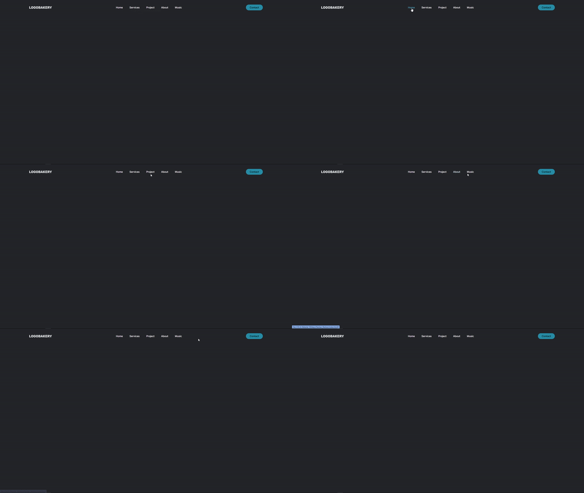
This is the final version of the navbar if you are following the source code then this will look like this and you can modify and change as per your requirement. That’s shit hope you like this tutorial I will provide you the source file link where you can download the sources.
Download Source Code
People are also reading:
- Crypto-currency website| Source Code Free Download
- How To Create Sign Up Form In HTML and CSS
- Top Stunning Free Websites to Download Responsive HTML Templates 2021
- 5 amazing ways to earn Money online as a side option .
- Top Best Free Resources For Free Stock Photos
- 5 amazing ways to earn Money online as a side option .
- finest alternative of Chinese apps for Android and iOS
- Top Best 5 Fonts Of 2020 Used By Professional Graphic Designers


